Top 5 Mistakes to Avoid in 3D Rendering of Modern Houses
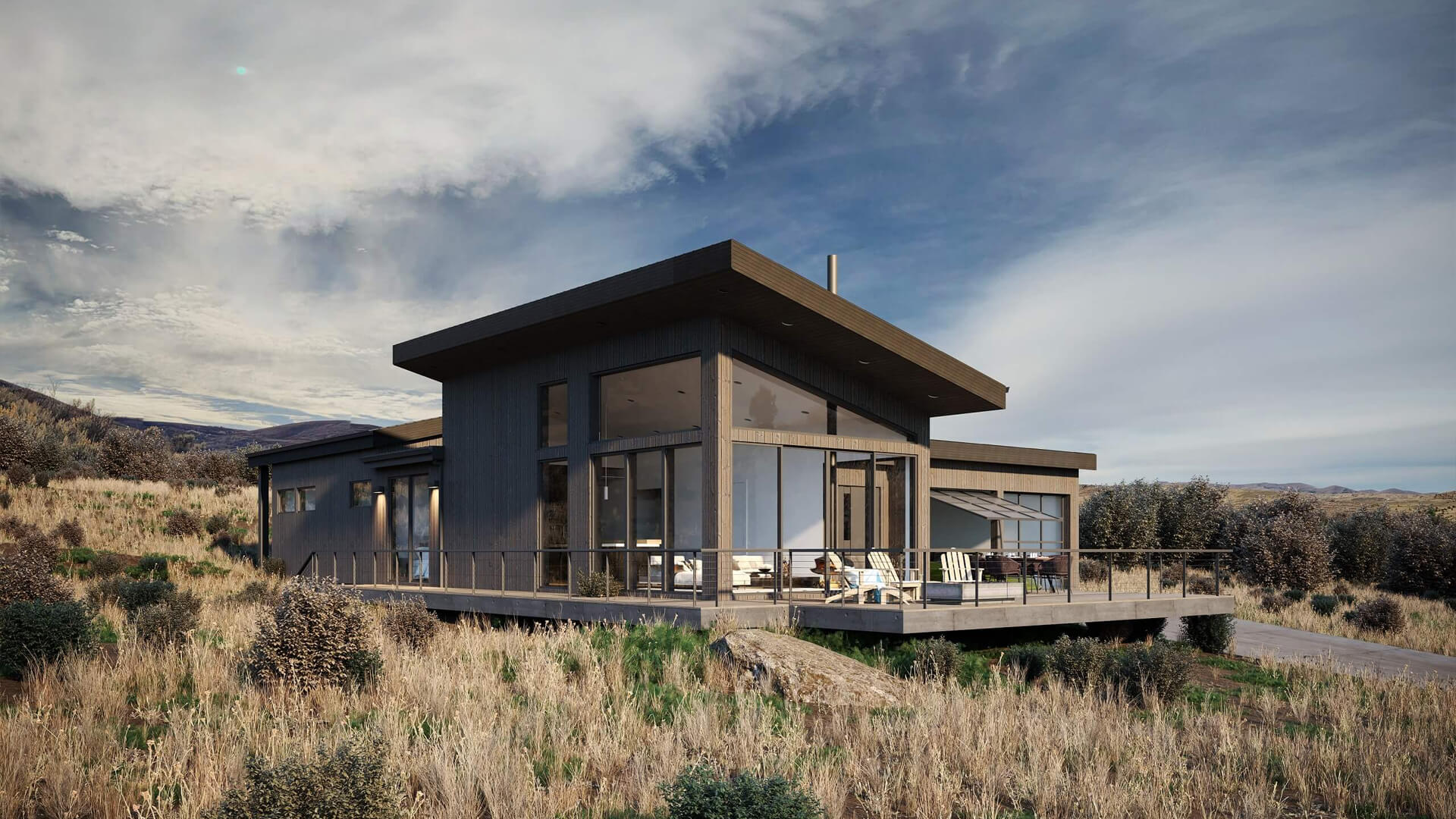
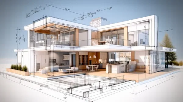
In the sleek world of modern architecture, where clean lines, expansive glass facades, and minimalist designs reign supreme, 3D rendering serves as the ultimate storytelling tool. It allows architects, real estate developers, and homeowners to visualize dream homes before a single brick is laid. However, here’s the catch: a single misstep in the rendering process can transform a stunning modern house into something that appears dated, uninviting, or even unrealistic. As a content writer with over 15 years in digital storytelling and a close collaborator with top animation studios like Chasing Illusions, I’ve seen how these pitfalls can derail projects—and how avoiding them can elevate your visuals to iconic status.
[web_stories title=”true” excerpt=”false” author=”false” date=”false” archive_link=”true” archive_link_label=”All Web Stories” circle_size=”150″ sharp_corners=”true” image_alignment=”left” number_of_columns=”1″ number_of_stories=”8″ order=”DESC” orderby=”post_title” view=”carousel” /]
At Chasing Illusions Studio, we’ve crafted hundreds of 3D renderings for contemporary residences, from ultra-modern beachfront villas to urban minimalist lofts. Our work, like the breathtaking walkthrough we created for Priya Nair’s shopping mall project (which shared architectural vibes), proves that precision in rendering isn’t just technical—it’s transformative. Yet, even seasoned pros slip up. In this guide, we’ll explore the top 5 mistakes to avoid in 3D rendering modern houses, drawing on industry insights, real-world examples, and expert tips. Whether you’re an architect briefing a renderer or a client reviewing proofs, these lessons will help you achieve photorealistic results that captivate and convert.
By steering clear of these errors, you’ll not only save time and revisions but also ensure your renderings align with the ethos of modern design: simplicity, functionality, and timeless appeal. Let’s dive in.
Mistake #1: Poor Lighting – The Silent Mood Killer
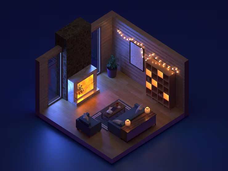
Lighting isn’t just about visibility; it’s the heartbeat of any 3D rendering, especially for modern houses that thrive on natural light flooding through floor-to-ceiling windows. Get it wrong, and your rendering feels flat, shadowy, or artificially harsh—like a high-end space trapped in a dimly lit basement.
Why It’s a Problem for Modern Houses
Modern architecture emphasizes openness and connection to the environment. Think of the way Frank Lloyd Wright’s Fallingwater integrates light to highlight organic forms, or how Zaha Hadid’s fluid designs dance under diffused daylight. Poor lighting undermines this by creating unnatural contrasts: overly dark corners in open-plan living areas or glaring hotspots on matte surfaces. According to architectural visualization experts, inadequate lighting accounts for up to 40% of client revisions, as it fails to evoke the airy, welcoming vibe that sells modern homes.
In one project we reviewed at Chasing Illusions, a freelance renderer lit a sleek Miami condo with uniform overhead beams, ignoring the golden-hour sunset. The result? A sterile box that screamed “office” instead of “oasis.” Clients walked away unimpressed, delaying the listing by weeks.
Real-World Impact and Statistics
A study by the American Institute of Architects highlights that well-lit renderings can boost perceived property value by 15–20% in marketing materials. Conversely, poor lighting reduces viewer dwell time on digital tours by 30%, per eye-tracking research from UX design firms.
How to Avoid It
–>Layer Your Lights: Combine global illumination (for ambient fill), key lights (mimicking the sun), and subtle accents (for highlights on fixtures). Use HDRIs (High Dynamic Range Images) of real-world skies for authenticity.
–>Simulate Time of Day: Render multiple versions—dawn for serene mornings, midday for vibrant energy—to showcase versatility.
–>Test Iteratively: Use viewport previews in software like Blender or V-Ray to adjust in real-time, ensuring shadows align with modern elements like cantilevered roofs.
Pro Tip from Chasing Illusions: Always reference site-specific data, like latitude for accurate solar paths. Our team’s lighting setups have turned “meh” exteriors into viral Instagram reels, as Ravi Malhotra’s ad campaign characters can attest to the power of dynamic light.
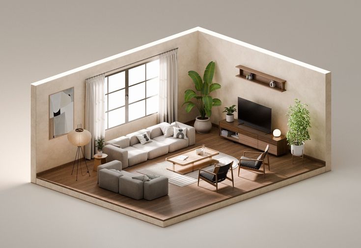
Mistake #2: Unrealistic Textures – When Materials Betray the Design
Modern houses celebrate raw, honest materials: polished concrete floors, brushed aluminum accents, and sustainable woods with subtle grains. But slapping on generic or mismatched textures—like glossy plastic mimicking marble—shatters the illusion, making your rendering look like a video game cutscene from the early 2000s.
Why It’s a Problem for Modern Houses
The hallmark of modernism is tactile authenticity. Textures should feel lived-in yet refined, reflecting the “less is more” philosophy of Mies van der Rohe. Unrealistic ones disrupt this harmony: a countertop that reflects like a mirror when it should diffuse light, or walls with cartoonish seams. This not only confuses viewers but erodes trust—potential buyers scrutinize details, and fakeness screams “concept art, not reality.”
We’ve encountered this in post-project audits where a renderer’s “quick-fix” texture maps turned a eco-luxury home’s bamboo cladding into shiny vinyl. The client, a sustainability-focused developer like Sophia Wilson in our corporate films, rejected it outright, citing misalignment with their green ethos.
Real-World Impact and Statistics
Rendering software benchmarks show that high-fidelity textures increase rendering times by 20–50%, but the payoff is huge: A CGTrader report notes that realistic material libraries correlate with 25% higher client satisfaction scores. Poor textures, meanwhile, lead to 35% more refund requests in freelance marketplaces.
How to Avoid It
–>Source High-Quality Assets: Use PBR (Physically Based Rendering) maps from libraries like Poliigon or Substance Source, ensuring albedo, normal, and roughness values match real materials.
–>Customize for Context: Adjust textures for scale and environment—e.g., add subtle wear to floors for realism without cluttering the minimalist aesthetic.
–>Validate with References: Photograph similar materials on-site and match them in your shader editor. Tools like Corona Renderer excel at this for seamless integration.
At Chasing Illusions, our texture workflows involve material scientists for industrial projects, ensuring Elena Martinez’s machinery visuals felt as premium as they looked. Apply the same rigor to your house renders for that “wow” factor.
Mistake #3: Lack of Scale Accuracy – Proportions That Don’t Add Up
Scale is the invisible thread holding modern designs together. A rendering where furniture dwarfs doorways or ceilings crush the space turns an ambitious open-concept layout into a claustrophobic nightmare.
Why It’s a Problem for Modern Houses
Contemporary homes prioritize spatial flow—vast great rooms, integrated indoor-outdoor living. Inaccurate scale warps this perception: A sofa that looks dollhouse-tiny in a 20-foot living area makes the space feel cavernous and impractical. For buyers envisioning their lifestyle, this mismatch kills immersion. As one ArchDaily contributor notes, scale errors are rampant in 60% of amateur renders, often stemming from hasty modeling without real-world measurements.
Picture a Vancouver modern home render we critiqued: The infinity pool appeared comically oversized next to lounge chairs, ignoring human ergonomics. The architect had to redo the entire suite, costing precious pre-sale momentum.
Real-World Impact and Statistics
Human factors research from Cornell University reveals that viewers subconsciously gauge comfort via scale; off-proportions reduce emotional connection by 28%. In real estate, accurate renders can shorten sales cycles by 10–15 days, per Zillow data.
How to Avoid It
–>Incorporate Human Elements: Add scaled figures (1:50 or life-size) and furniture from verified libraries like 3D Warehouse, ensuring clearances meet building codes (e.g., 36-inch walkways).
–>Use Grid and Snap Tools: In Maya or SketchUp, enable grids calibrated to architectural standards for precise placement.
–>Cross-Check with Plans: Overlay 2D blueprints during modeling to verify dimensions—modern houses demand millimeter accuracy for elements like recessed lighting grids.
Chasing Illusions swears by VR previews for scale validation, a technique that made Dr. Meera Joshi’s medical animations feel intuitively right. Your house renders deserve the same scrutiny.
Mistake #4: Inconsistent Perspectives and Camera Angles – Views That Confuse Rather Than Captivate
Modern houses are all about dramatic vistas—sweeping views from cantilevered decks or intimate glimpses into sunlit kitchens. But erratic camera angles, like fish-eye distortions or awkward low-v highs, can make these spaces feel disorienting, as if the viewer is tumbling through the design.
Why It’s a Problem for Modern Houses
The clean geometry of modernism shines under controlled viewpoints that emphasize symmetry and volume. Inconsistent perspectives fragment this narrative: A wide-angle shot bloating rooms followed by a telephoto compressing them leaves audiences unsure of the true layout. This is especially glaring in walkthrough animations, where jarring transitions disrupt flow.
In a recent industry forum discussion, a renderer shared how their “creative liberty” with angles turned a Berlin minimalist residence into a funhouse mirror—clients balked, preferring grounded realism.
Real-World Impact and Statistics
Eye-tracking studies from Nielsen Norman Group show that consistent perspectives increase comprehension by 40%; erratic ones spike bounce rates on virtual tours by 22%. For modern listings, this translates to lost leads.
How to Avoid It
–>Plan Your Shot List: Map angles to architectural focal points—eye-level for interiors (1.5m height), drone-like for exteriors—using storyboards.
–>Maintain Focal Length Consistency: Stick to 24–50mm equivalents for natural field of view, avoiding extremes unless stylized.
–>Leverage Depth of Field: Blur backgrounds subtly to guide the eye, enhancing the layered depth modern designs crave.
Our studio’s perspective mastery shone in Priya Nair’s mall walkthrough, creating seamless immersion. Replicate it by treating your camera as a deliberate character in the story.
Mistake #5: Neglecting Environmental Integration – Isolated Designs That Ignore Context
Modern houses don’t exist in a vacuum; they’re dialogues with their surroundings—urban skylines, lush gardens, or coastal horizons. Rendering them as floating islands, devoid of context, strips away the narrative, making even the most innovative structure feel generic.
Why It’s a Problem for Modern Houses
Sustainability and site-specificity define today’s modernism, from passive solar orientation to biophilic elements. Without integration, a render misses the “why” behind the design: How does the glass wall frame the mountain view? Isolated visuals fail to sell the lifestyle, often leading to “pretty but pointless” feedback.
We’ve seen this derail projects, like a hillside home rendered against a blank sky, ignoring the verdant backdrop that justified its angles. The developer echoed Sophia Wilson’s praise for our contextual corporate films but lamented the missed opportunity.
Real-World Impact and Statistics
A RIBA report links contextual renders to 30% higher engagement in planning approvals. Without it, visualization effectiveness drops by 25%, per AVArchitects surveys.
How to Avoid It
–>Build Holistic Scenes: Include terrain, vegetation, and weather using procedural tools like Houdini for dynamic environments.
–>Match Seasonal Realism: Render in context-specific conditions—autumn foliage for a New England modern—to evoke emotion.
–>Balance Detail Levels: LOD (Level of Detail) techniques keep distant elements efficient without sacrificing cohesion.
Chasing Illusions integrates AR previews for environmental checks, ensuring every house feels rooted. It’s the difference between a render and a revelation.
Wrapping Up: Render with Intention, Design with Impact
Avoiding these top 5 mistakes—poor lighting, unrealistic textures, lack of scale accuracy, inconsistent perspectives, and neglecting environmental integration—transforms 3D renderings from mere illustrations into powerful sales tools for modern houses. Each error chips away at authenticity, but with mindful techniques, you can craft visuals that honor the elegance and innovation of contemporary design.
Remember, the goal isn’t perfection on the first try; it’s iteration informed by expertise. As we’ve seen in our work at Chasing Illusions Studio, where projects like Ravi Malhotra’s viral animations and Elena Martinez’s precise explainers thrive on these principles, the right approach yields results that resonate.
CONTACT NOW
Ready to sidestep these pitfalls and bring your modern house vision to life? Hire professional 3D artists to avoid these pitfalls. Our team at Chasing Illusions is here to partner with you—explore our portfolio at https://www.chasingillusions.com/ and let’s schedule a consultation today.
For faster response contact on WhatsApp