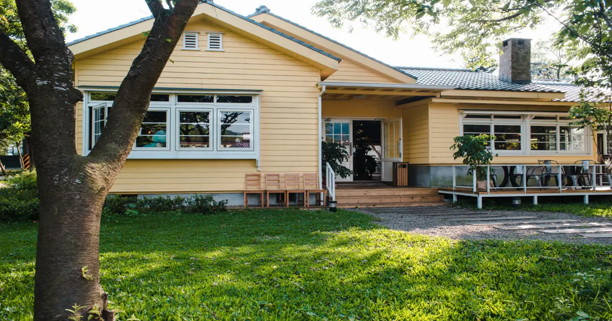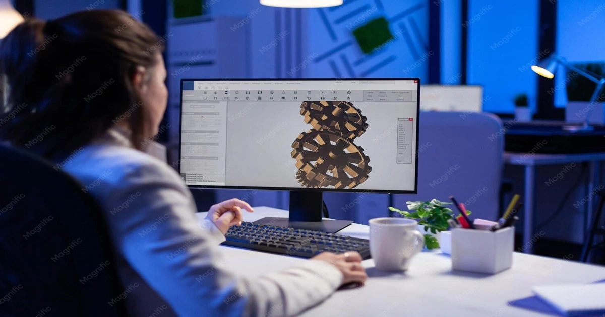
Modern architecture — clean lines, expansive glass, minimalist detailing — is unforgiving in a rendering. There's very little visual clutter to hide a mistake, which means small errors in lighting, texture, or scale read immediately as "off" in a way they might not on a more traditional design. A single misstep can turn a striking modern home into something that looks flat, artificial, or subtly wrong, even if a viewer can't immediately articulate why.
Here are the five mistakes that most commonly undermine modern house renders, and what to do instead.
Mistake #1: Poor Lighting
Lighting is arguably the single biggest factor in whether a render feels real. Modern architecture leans heavily on natural light — floor-to-ceiling glazing, open-plan spaces designed around how sunlight moves through them across the day. Get the lighting wrong, and the render feels flat, unnaturally shadowed, or harshly lit in a way that undermines the airy, open quality the design is actually going for.
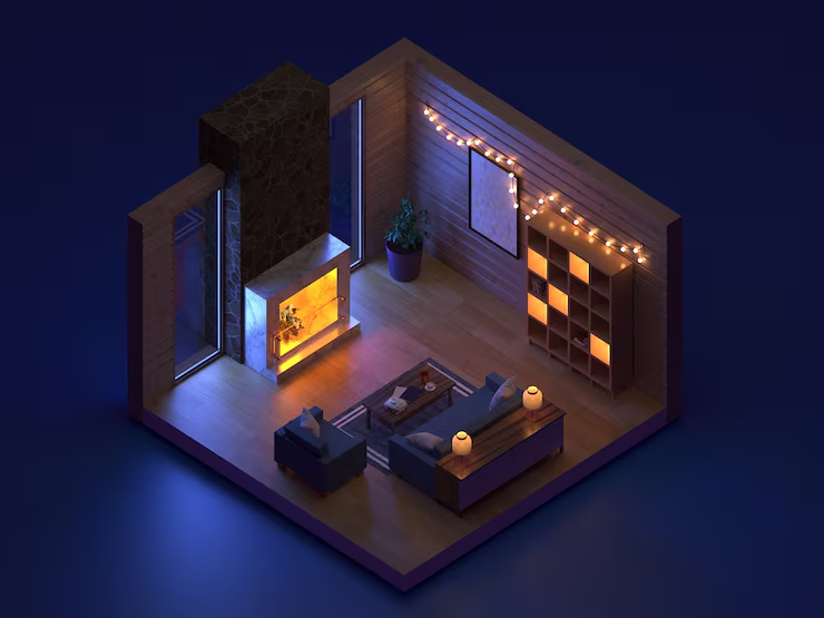
Why it matters more for modern houses specifically: with fewer decorative elements to distract the eye, lighting does more of the work of making a space feel inviting. A uniform, flat lighting setup on a minimalist interior reads as sterile rather than sophisticated — the opposite of what the design intends.
How to avoid it:
Layer your lighting — combine ambient global illumination, a key light simulating the sun, and subtle accent lighting on fixtures, rather than relying on one flat light source.
Render at a specific, considered time of day rather than defaulting to generic midday light — golden hour or soft morning light often reads as more inviting for residential work.
Use real-world HDRIs (high dynamic range environment images) for authenticity rather than a generic studio backdrop.
Reference the actual site's latitude and orientation so shadows and sun angles are physically plausible, especially for distinctive elements like cantilevered rooflines.
Mistake #2: Unrealistic Textures
Modern design celebrates honest, tactile materials — polished concrete, brushed metal, natural wood grain. Generic or mismatched textures — glossy plastic standing in for stone, a flat color where there should be subtle variation — break the illusion immediately and make a render look synthetic rather than photorealistic.
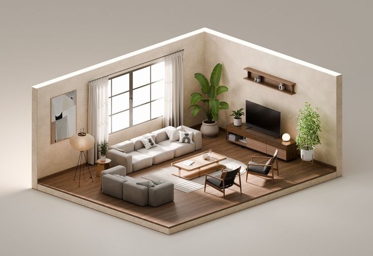
Why it matters more for modern houses specifically: because modern interiors are often deliberately sparse, materials carry more visual weight than they would in a more heavily decorated space. There's nowhere for a bad texture to hide.
How to avoid it:
Use physically-based rendering (PBR) material libraries with accurate roughness, reflectivity, and normal map data rather than generic flat textures.
Adjust textures for scale and context — real materials have subtle variation and wear, and a texture that looks right at a small scale can look artificial when applied across a large surface.
Where possible, reference real photos of the intended materials and match them directly in your shader setup rather than relying on a generic preset.
Mistake #3: Inaccurate Scale
Scale errors are subtle but immediately undermine believability. Furniture that's slightly too large or small for a room, ceilings that read as too low or too high, doorways that don't match human proportions — these mistakes are often not consciously noticed by a viewer, but they register as "something's off."
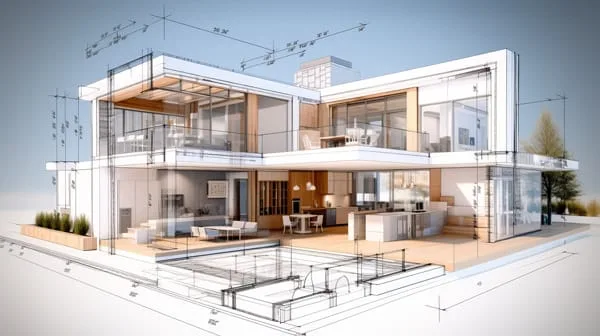
Why it matters more for modern houses specifically: open-plan modern layouts depend on a sense of spatial flow that's very sensitive to proportion. A living space that's meant to feel expansive can instead feel oddly cavernous or cramped if the scale is even slightly wrong.
How to avoid it:
Use verified furniture and fixture libraries with accurate real-world dimensions, rather than resizing generic assets by eye.
Enable grid and snap tools calibrated to real architectural measurements during modeling.
Cross-check the model against the original 2D blueprints throughout the process, not just at the end, to catch scale drift early.
Add human-scale reference figures during the modeling process — it's one of the fastest ways to catch a proportion error before it's baked into the final render.
Mistake #4: Inconsistent Camera Angles and Perspective
Modern houses are often designed around specific, deliberate views — a framed vista from a deck, a considered sightline through an open floor plan. Erratic camera choices (extreme wide-angle distortion, inconsistent focal lengths between shots) undermine that intentionality and can leave a viewer with a confused sense of the actual layout, especially across a multi-shot set or an animated walkthrough.
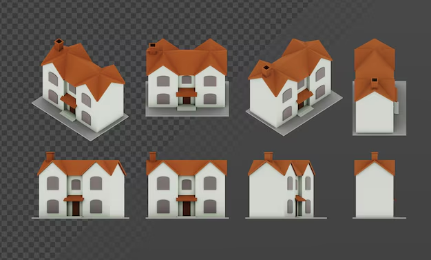
How to avoid it:
Plan a shot list in advance, tied to the architecture's actual focal points, rather than choosing angles arbitrarily during rendering.
Keep focal length consistent across a set of images (something close to a natural 24-50mm equivalent works well for most architectural interiors) unless a specific stylized wide shot is intentional.
Use depth of field deliberately to guide the eye toward the intended focal point of a scene, rather than leaving everything in uniform sharp focus.
Mistake #5: Ignoring Environmental Context
A modern house rendered in isolation — no landscaping, a flat generic sky, no sense of its actual surroundings — loses a lot of what makes the design meaningful. Modern architecture is frequently designed in direct response to its site: a glass wall framing a specific view, an orientation chosen for solar performance. Stripping that context out of the render strips out the reasoning behind the design.
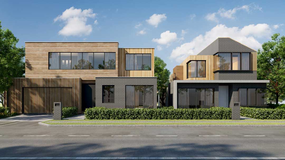
How to avoid it:
Build out real environmental context — terrain, vegetation, neighboring structures — rather than rendering the house as a floating object against a blank backdrop.
Match seasonal and regional realism to the actual location, rather than defaulting to a generic clear day.
Balance the level of detail sensibly — distant elements don't need the same fidelity as the building itself, but they do need to be present.
The Common Thread
Every mistake on this list comes down to the same underlying issue: modern architecture's minimalism removes the visual noise that would otherwise hide a small error. That's precisely why professional rendering for contemporary homes tends to demand more careful attention to lighting, material accuracy, scale, and context than a more traditionally styled project — there's simply less room for anything to look "close enough."
Getting It Right
If you're commissioning a render for a modern house project, ask directly how a studio handles lighting setup, material sourcing, and scale verification — the answers will tell you a lot about the quality you can expect, beyond just looking at portfolio images.
Ready to get your modern house rendered right the first time? [Get a Quote →]
Book a discovery 20-minutes strategy call.
📞 +91-9910911696 | +91-9910660851
📩 info [@] chasingillusions [.] in
Written by Deepak, Content Strategist at Chasing Illusions Studio. Our clients include Ambler Surgical, Practo, Bayer, SMT, Novartis, and 100+ healthcare brands across India, USA, Thailand, and the UK.
Chasing Illusions Studio
Premium animation & video production studio based in Delhi, India. Specialising in 3D animation, medical visualisation, architectural walkthroughs, and CGI.